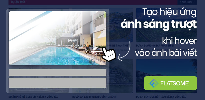
Thêm hiệu ứng ánh sáng khi hover ảnh sản phẩm Woocommerce bằng CSS
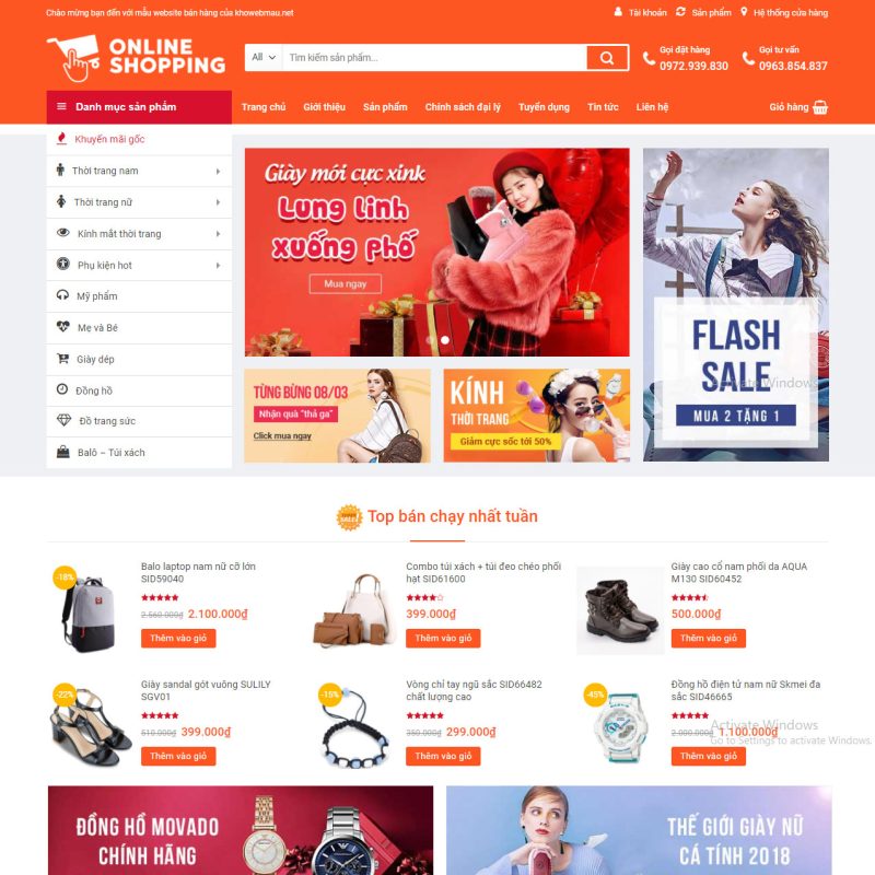
Hôm nay, chúng mình sẽ hướng dẫn các bạn cách tạo hiệu ứng ánh sáng khi hover vào hình ảnh trong Flatsome cực kỳ đơn giản.
.box-image:hover::before, .post-item:hover .box-image::before , .img:hover .img-inner::before{
-webkit-animation:shine .75s;animation:shine .75s
}
@-webkit-keyframes shine{
100%{left:125%}
}
@keyframes shine{
100%{left:125%}
}
.box-image::before, .img .img-inner::before{
position:absolute;
top:0;
left:-75%;
z-index:2;
display:block;
content:'';
width:50%;
height:100%;
background:-webkit-linear-gradient(left,rgba(255,255,255,0) 0,rgba(255,255,255,.3) 100%);
background:linear-gradient(to right,rgba(255,255,255,0) 0,rgba(255,255,255,.3) 100%);
-webkit-transform:skewX(-25deg);transform:skewX(-25deg)
}
.product-small.box:after, .mh-col-shadow > .col-inner:after, .post-item > .col-inner:after {
content: '';
position: absolute;
bottom: 0;
left: 0;
height: 3px;
width: 100%;
transform-origin: right;
transition: transform .5s ease-in-out;
transform: scaleX(0);
}
.product-small.box:after, .mh-col-shadow > .col-inner:after, .post-item > .col-inner:after {
background: var(--primary-color);
}
.product-small.box:hover:after , .mh-col-shadow:hover > .col-inner:after, .post-item:hover > .col-inner:after {
transform-origin: left;
transform: scaleX(1);
}
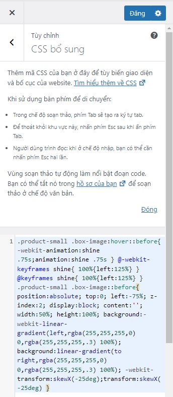
Nếu bạn không dùng theme Flatsome thì có thể vào menu Giao diện -> Tùy biến -> CSS bổ sung để thêm code css
Xem thêm:
Bài viết cùng chủ đề:
-

Hướng Dẫn Di Chuyển Import Website Bằng Plugin All-in-One WP Migration
-

Chia Sẻ Website WordPress Theme Flatsome Giao Diện Giống Shopee
-

Cách ẩn thông báo bản quyền theme Flatsome vô cùng đơn giản
-

Sửa lỗi khung bình luận Facebook trên website WordPress đột nhiên bị thu hẹp chiều rộng
-

Hướng dẫn chèn Breadcrumbs cho website WordPress sử dụng plugin Yoast Seo
-

Thêm hiệu ứng ánh sáng khi hover vào ảnh bài viết trong theme Flatsome